

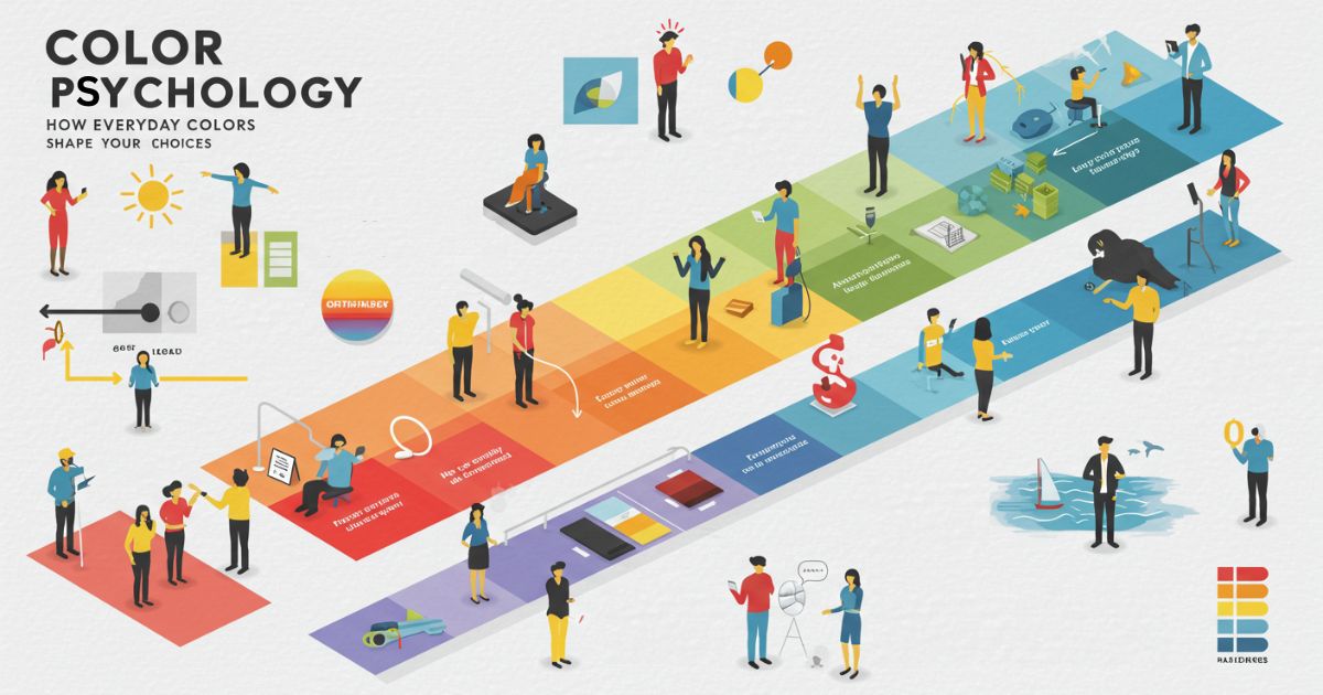
Color psychology reveals how everyday colors quietly shape our emotions, behaviors, and choices. From the calming effect of blue walls to the energizing power of red accents, the hues that surround us carry meanings that influence mood and decision-making in subtle yet powerful ways. Far from being just decoration, color is a silent force that guides perception, sparks creativity, and even affects physical responses. By understanding the emotional impact of colors, we can design environments that foster positivity, focus, and balance in everyday life.
The Science of Color Perception
At a biological level, color perception begins with light, which consists of electromagnetic waves of varying wavelengths. When light hits an object, certain wavelengths are reflected while others are absorbed. These reflected wavelengths enter our eyes and reach the retina, where specialized photoreceptors called cones translate them into neural signals. Evolutionary psychologists suggest that color sensitivity helped early humans identify ripe fruits, predators, and safe environments, embedding a deep-rooted emotional response to different hues in our neural circuitry.
Cones in our eyes are tuned to short (blue), medium (green), and long (red) wavelengths. This trichromatic vision allows us to distinguish millions of shades. Once these signals reach the visual cortex, they’re interpreted in conjunction with memory, cultural context, and personal experience—resulting in the emotional and behavioral effects we observe.
Cultural and Individual Differences
While scientific research outlines general patterns, cultural nuances and personal history can alter how colors are perceived. For instance, white signifies purity in Western cultures but is traditionally associated with mourning in some Eastern societies. Personal preferences—shaped by memories, associations, and even marketing—add another layer of complexity.
Moreover, individuals with color vision deficiencies may experience or react to colors differently, emphasizing the subjective nature of color influence. Designing spaces or products with inclusivity in mind means considering both universal tendencies and unique perspectives.
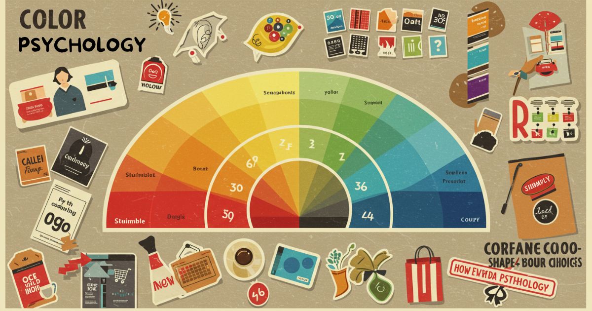
The Emotional Palette: How Basic Hues Affect Us
Red
Red is often linked to excitement, passion, and urgency. Studies show it can increase heart rate and stimulate appetite, making it a popular choice in restaurant design and sale signage. However, prolonged exposure may induce feelings of aggression or stress if overused.
Blue
Blue evokes calmness, trust, and reliability. It’s commonly used in corporate logos and healthcare settings to promote a sense of security. Research indicates that blue environments can lower blood pressure and encourage productivity, particularly in offices or study spaces.
Green
Green represents nature, balance, and growth. Exposure to green—whether indoors via plants or in painted accents—can reduce anxiety and restore mental fatigue. Natural green tones are especially effective in settings designed for relaxation and creativity.
Yellow
Yellow is associated with energy, optimism, and attention. It can stimulate mental processes and evoke warmth. While too much yellow may cause overstimulation or frustration, strategic pops of yellow can brighten moods and encourage communication in social areas.
Orange and Purple
Orange combines the energy of red and cheerfulness of yellow, often used to draw attention and inspire motivation. Purple blends the stability of blue and the energy of red, symbolizing luxury, creativity, and spirituality. Both hues work well as accent colors to add vibrancy without overwhelming the senses.
Colors in Productivity and Creativity
Workspace color schemes have a measurable impact on performance. Cool tones—like shades of blue and green—tend to enhance focus and reduce stress, while warmer tones—such as yellow or light orange—can spark creativity and collaboration. A balanced approach, with neutral backgrounds and strategic color accents, often yields the best results for both concentration and innovation.
Colors in Marketing, Branding, and Decision-Making
Brands leverage color to influence consumer perception and behavior. Fast food chains often use red and yellow to create a sense of urgency and hunger. Financial institutions lean towards blues to instill trust. Online retailers experiment with button colors to optimize click-through rates—switching from green to orange or vice versa can increase conversions by noticeable margins.
In decision-making, color cues can guide attention and simplify choices. For instance, highlighting a “recommended” product in a different color can direct consumers’ focus, reducing decision fatigue and boosting sales.
Learn More: Color Psychology
Harnessing Color in Your Environment: Practical Tips
- Home Office: Paint one wall in a calming green or soft blue to maintain focus and reduce stress.
- Living Spaces: Use warm yellows or muted oranges in communal areas to foster warmth and social interaction.
- Wardrobe Choices: Wear colors that align with your mood or the impression you wish to make—blue for reliability, red for confidence, or green for balance.
- Digital Tools: Customize software themes or wallpapers with colors that support your daily tasks, whether concentration or creativity.
- Seasonal Adjustments: Rotate colors with the seasons—lighter pastels in spring, vibrant tones in summer, earthy shades in fall, and cool neutrals in winter—to align with natural rhythms.
Case Studies: Real-World Examples
Tech Startup Office: A Silicon Valley startup revamped its office with light blue walls and green plant installations. Employees reported a 15% increase in productivity and a 20% reduction in stress-related complaints within three months.
Café Rebranding: A neighborhood café switched from dark brown décor to a palette of soft yellow and mint green. Customer dwell time increased by 25%, and social media check-ins rose by 40% thanks to the inviting atmosphere and “Instagrammable” aesthetic.
Debunking Common Myths about Colors
Myth: Red always increases aggression. Reality: Context matters—red in a romantic setting can heighten attraction, not anger. Myth: Blue rooms feel cold. Reality: Pairing blue with warm accents or natural materials can maintain coziness while preserving calm.
Conclusion
Colors are more than visual stimuli; they’re powerful influencers embedded in our psychology and culture. By understanding the science behind color perception and its real-world effects, you can intentionally shape your environment, brand, and personal choices for improved well-being, productivity, and satisfaction. Just as everyday habits subtly guide behavior and decision-making, the colors around you can reinforce routines, boost motivation, and influence mood. Next time you pick that wall paint or choose a favorite mug, remember: every hue has a story and a subtle power to transform your daily life.


